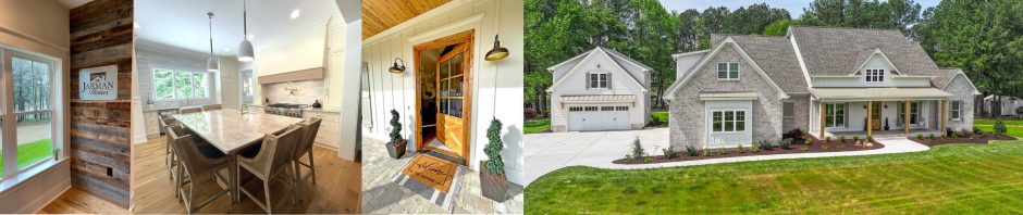
For all the Pinterest fans out there, photos of gorgeous cabinets are probably one of the more popular posts for home design enthusiasts. And believe me, I love looking at all the beautiful photos as well. One thing you have to consider when looking at all the gorgeous photos of homes, is more times than not they are coming from million dollar projects. So we all admire and dream we can have those million dollar looks in our own homes. I’m no different. I had collected photos for years before designing my own Kitchen in our new home.

And I can honestly say, once I put all the various ideas together, I couldn’t be happier with how my Kitchen turned out.


The reality is I would have never been able to afford my current Kitchen back when we built our first or second home. So the challenge is creating those million dollar looks in our own Kitchen designs within a more realistic budget. We’ve been building for over 25 years now and I have honestly never had a client that said to me, “money is no object”. I hope to one day get a client like that, but for now, I’ve gotten pretty good at getting the most out of the budget we have to work with. One thing Neil and I do is try to create a sufficient allowance up front for clients to get what they want. So let’s get started.
As a recap, for our Parade of Homes entry, my selection process began with the Brick color. From there, I knew I wanted the overall color scheme to be light in color and pull all the whites, browns, and blue-gray tones to coordinate with the beautiful brick that will be a prominent feature on the two story fireplace. In the last blog post we discussed all the countertops in the home and coordinating cabinet colors. From there, I coordinated tile and paint. Here’s what we have so far:


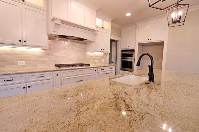
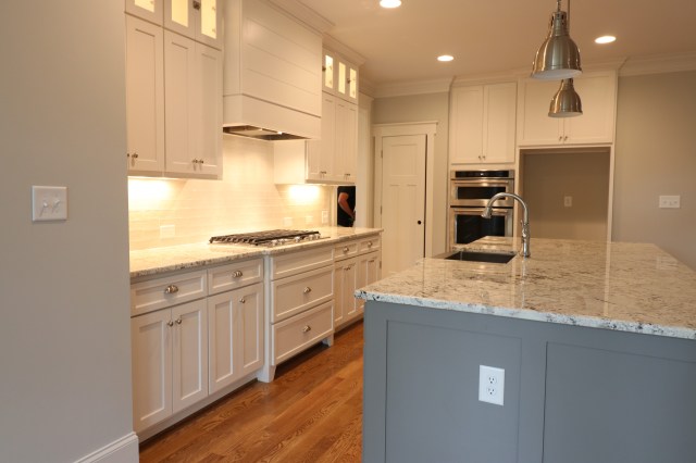
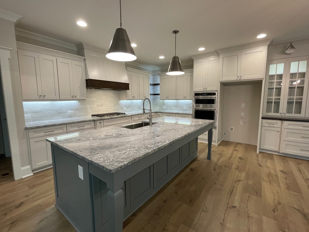
In regards to overall design, I’ve always believed the Kitchen is the heart of the home. So generally, whether I’m working on a spec home or working with a presale client, I like starting in the Kitchen and working out from there. In the Meadow floorplan, we have a great open Kitchen layout with a large Island to work with. I love the symmetry of the Perimeter wall. Back when we completely redrew the Kitchen layout from the original plan, we purposely moved the oven/microwave combo to the wall with the refrigerator in order to create a nice balance and focal point on the hoodvent wall. In this plan, the ceiling heights are 9’ which I like for a Kitchen because it makes its easier to run the cabinets up to the ceiling. For 10’ ceilings we have to add a soffit that comes down.
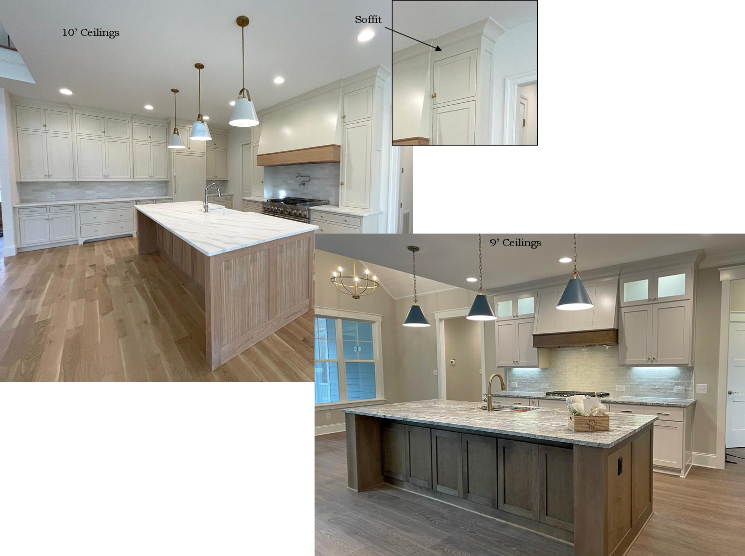
OR you can stop the cabinet short of the ceiling and then determine if you want to leave them at the same level or staggered heights. All things to consider when designing the kitchen.
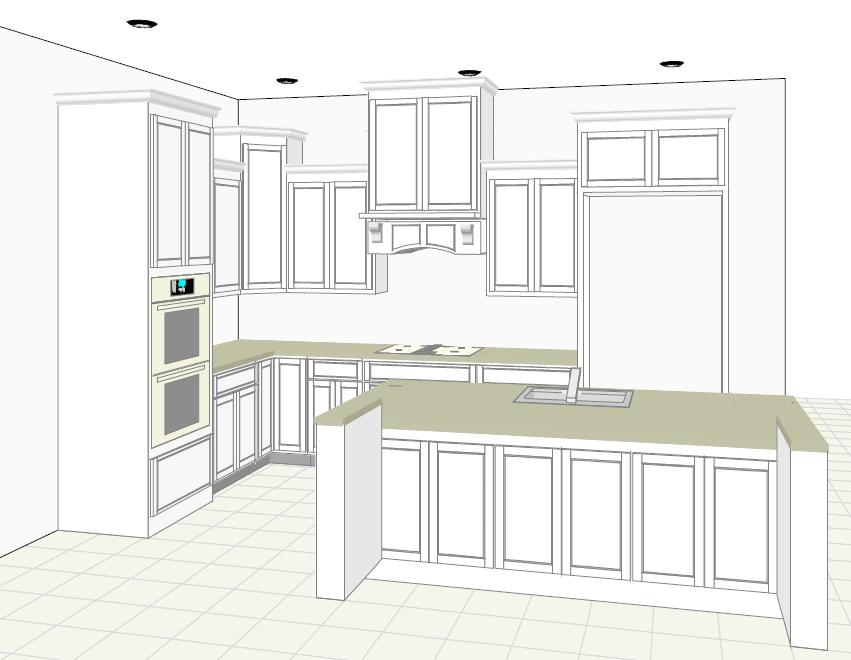

In this Meadow Kitchen, I love the symmetry of the main perimeter wall. There is plenty of space to add upper cabinets with glass doors and accent lighting for added “wow”. Also on this wall the hoodvent is a big focal point. Over the years I’ve used many hood vent designs. Here’s a few of my favorites:


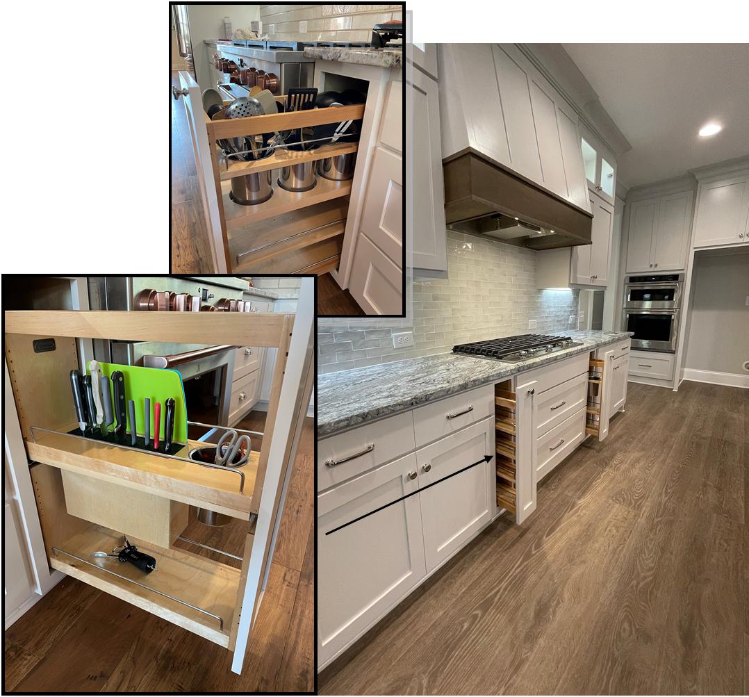
Another added feature I love using whenever I can are storage pullouts. In this Kitchen, I am able to add a pullout on each side of the cooktop. These pullouts are so functional. You can choose from different configurations, but my personal favorite is the Knife Block and the Large Utensil cans. It helps get all that clutter off the countertops.
My favorite part of the kitchen design is the 10’ island. I personally don’t like going any bigger than 10’, even in plans that may call for a larger island. The reason is I don’t like seams in my countertops, and it’s hard to find oversized slabs that would accommodate anything bigger than 120”. This island is wide and deep; therefore, it provides an additional layer of storage hidden on the backside underneath the bar top. I’m a firm believer that you can never have too much storage.
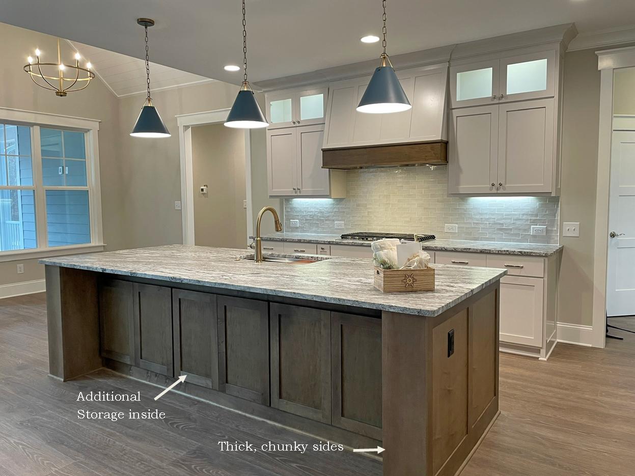
For this island I like using big chunky sides to support the overhang. But sometimes when the island is not as large, I like using decorative legs to support the overhang. Here are a few examples:


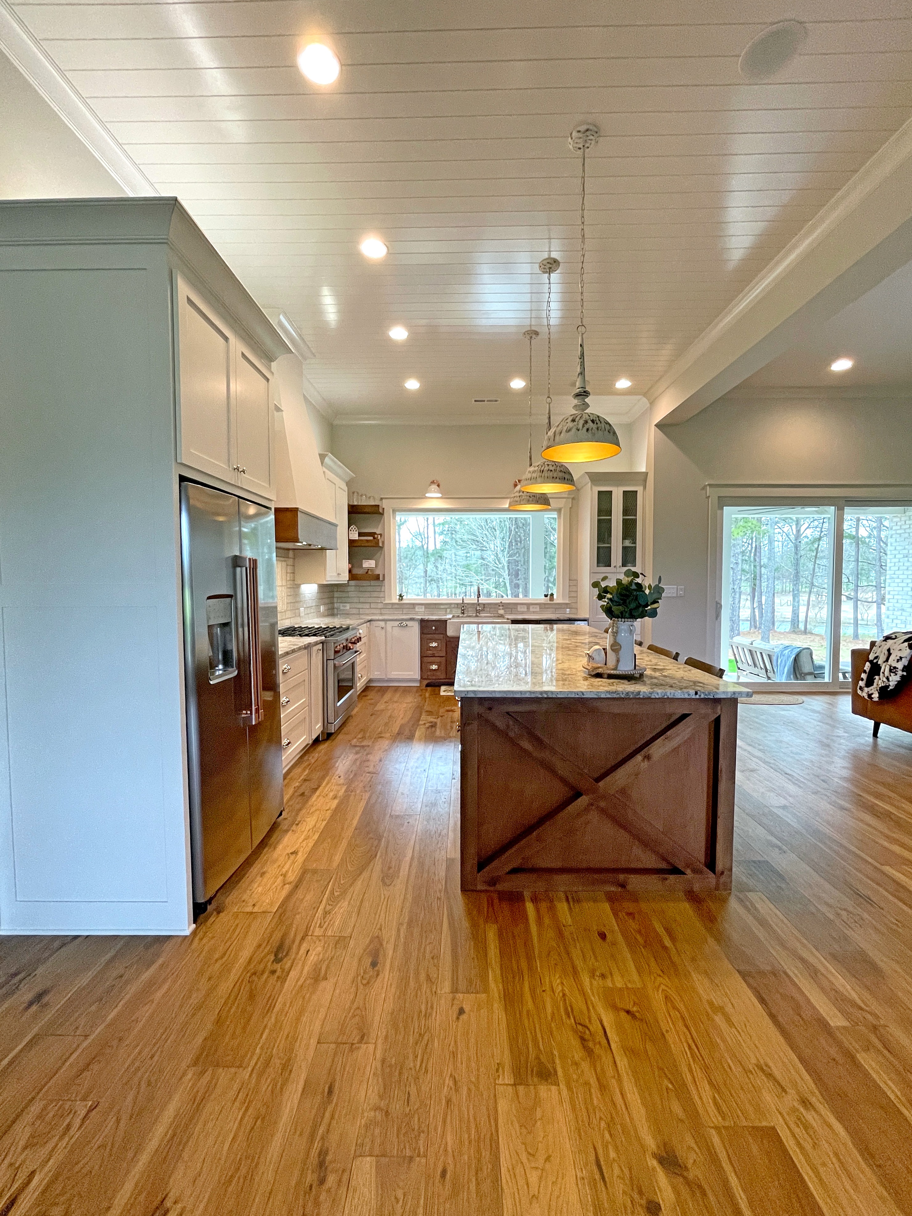
For my personal home, I knew I wanted an “x” design on the ends of my island to mimic the “x” beams in my foyer. My island also measures 10’ wide but even though I had plenty of room for a deeper island like the one in the Meadow, the deeper it got the more distorted the “x” design became. So I had to make the hard decision to forgo the extra storage in this case in effort to keep the end-panel design like I wanted. Sometimes, design decisions can be challenging. But overall, I’m super happy with the way it turned out and wouldn’t change a thing.
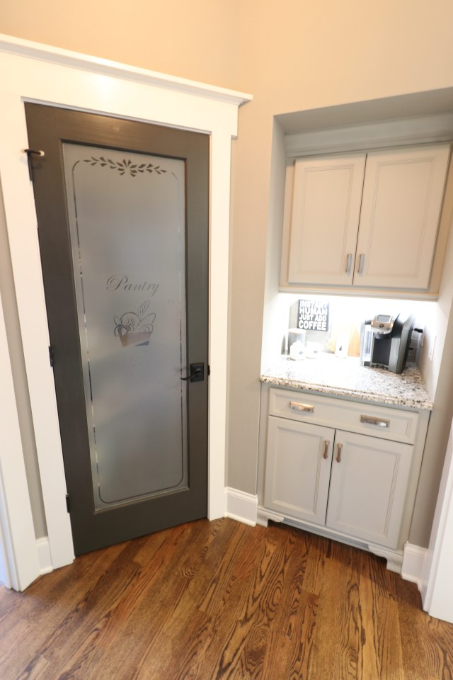
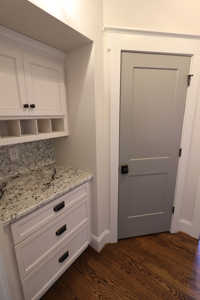
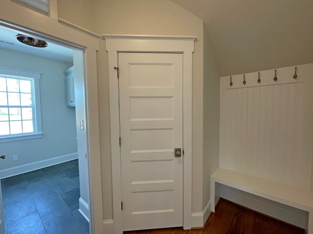
An added bonus in the Meadow, just off the Kitchen right beside the walk-in pantry, is a super cute Butler’s Pantry. You could use it as a Coffee Station or a Wine Bar; so many possibilities. It sits in that odd space underneath a set of stairs. If this house had a basement, it’s where the basement stairs would go. But since we are on a crawlspace foundation, I wanted to turn it into more than just a closet. Here are some different options we’ve done in the past:

From the Kitchen, my second favorite space to design is the Powder Room. The Powder room is where your guests will really appreciate its design. I always like to add some simple, cost effective design elements that really jazz up the small space and make it extra special. One way I like to make it unique is by designing a cabinet that looks more like a piece of furniture than a standard, everyday cabinet. And I love using color in this room. Either, by making the cabinet itself a bolder color choice or going with a stained cabinet and putting a bolder color on the Shiplap accent wall behind the cabinet. Here are some different styles we’ve done before:
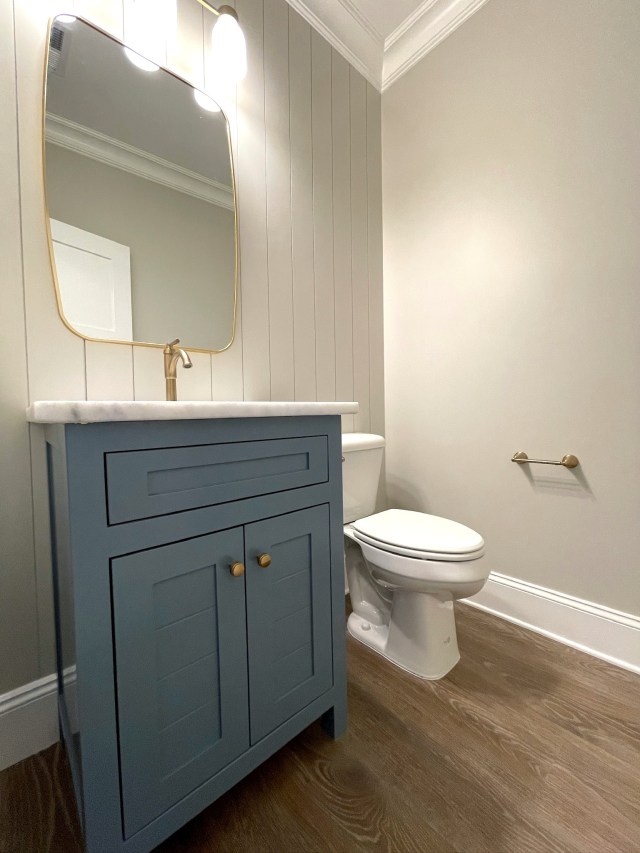

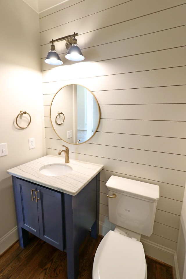


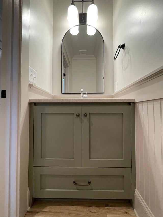
Add in a cute, decorative mirror, a nice plumbing & light fixture, and an upgraded tank lever and waalaa. . . a super cute Powder room your guests will marvel over.
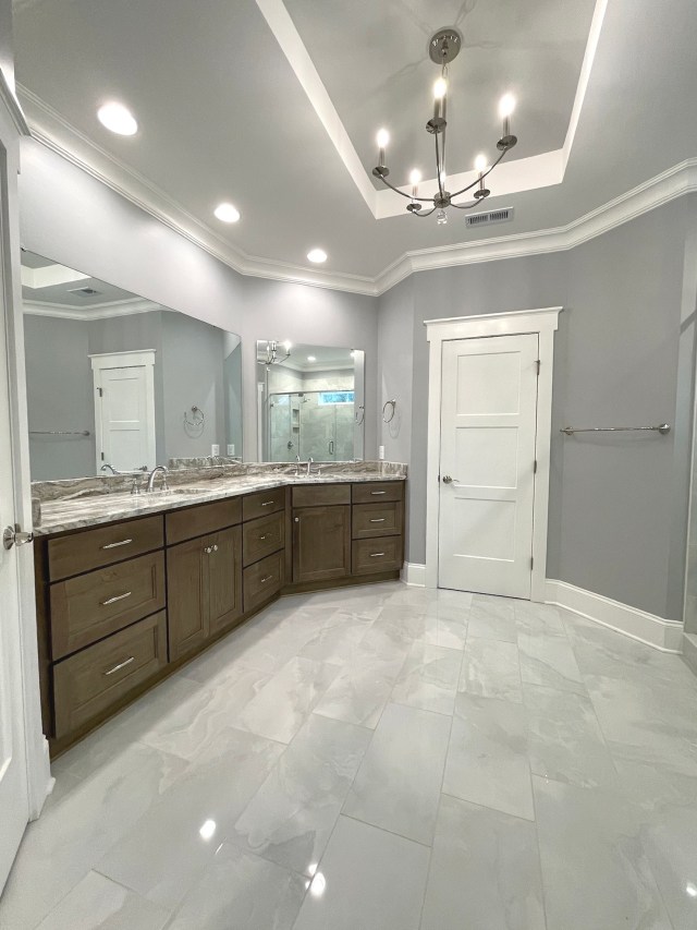
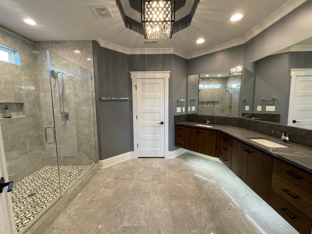
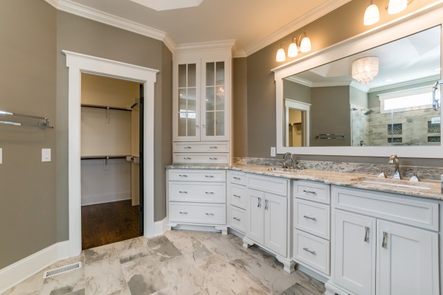
The next most important space regarding cabinetry is definitely the Master Bath. Outside of the Kitchen, this is where you will spend most of your time. This plan has a great size bathroom. The vanity is long and is a bit odd shaped because of the angle at one end.
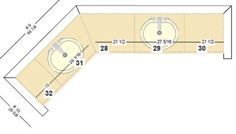
Over the years, we have done several configurations. The advantage of using a custom cabinet-maker is we can redesign the layout to fit your wants and needs. Here’s some examples.

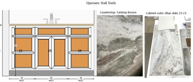
This plan has two additional secondary bathrooms that both have spacious cabinets with lots of drawer and countertop space.

Can’t wait to see it all finished.
I always love feedback, so let me know which Powder room cabinet is your favorite?
