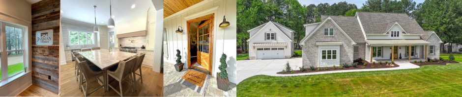
I want to thank everyone for patiently waiting for week 3 of my new series Countdown to the Parade of Homes. A lot has happened in the three weeks since I last wrote so let me catch you up with where we are to date. So far, we picked a plan, tweaked it, picked up permits, dug the footing, built the foundation, and now we are currently FRAMING. Things are moving quickly now but before we ever started to dig the footing, I had to have all my exterior selections made, submitted to the Architectural Review Board (ARB), and approved weeks before Neil was able to start construction. So let’s take a closer look at the exterior selections process for this year’s Parade Home entry.
When building in a subdivision, usually all Exterior Selections and improvements to the lot/home have to be submitted before the Architectural Review Board (ARB) for that subdivision. The ARB is either run by the Home Owners Association (HOA) or the Developer. As a builder, I like having an ARB that is in control of what can and cannot be built in the subdivision. I realize sometimes HOA’s can get a little extreme and overboard with some of their rules and policies, but for the most part, they are there to protect the homeowner from others building or doing something that would ultimately lower property values. As a general rule of Real Estate value, the concept of Conformity means properties within a given area tend to be similar in size, style, age, construction, and quality. The more you stray from these principles, the higher the likelihood of depreciating property values. Now, even though an ARB is in place, that doesn’t mean everything goes as smooth as you would like, but, from a builder point of view, it would be a greater risk to build a home in a subdivision with no ARB in place. Higher appraisal values are good for everyone.
I already discussed in week one that curb appeal is one of the most important factors when choosing a Parade Worthy floor plan. The trick is selecting a color and texture combination that stands out from the crowd yet is appealing and inviting at the same time. That is not always easy. I usually have some ideas in my head of some color schemes I’m wanting to go with early on. However, before I get too focused on a certain color and look, I need to make a site visit first to see what the surrounding home color schemes are. We don’t want to choose too similar of a color scheme and look as a neighboring home already built. The good news with this year’s Parade Home is there is only one other home right beside it we need to worry about since it’s a new section in the subdivision. I happen to know that color scheme because it is a presale of ours. So I am going to stay away from the Gray/taupe palette in order to stand out from the neighbor.
Funny story- I’ve had people ask me before how it is working with my husband. Well, to be honest, it’s not always as smooth as we would like. We are both head strong individuals that like to be the “right” one. Thankfully, for the most part, we complement each other very well. When I come up with ideas Neil tells me how it can be done and how much it’s going to cost. If we went with everything I wanted to do we would surely be bankrupt by now. For the most part, Neil has supported most of my design decisions. However, once, several years ago, I got a call from Neil. He was at one of our jobsites and the house was being painted that day. He called me with clear concern in his voice regarding the “yellow” that was being painted on the exterior. He called me because he thought surely that could not be the color I selected. I explained that once all the colors came together it was going to look great. He didn’t agree but let the painters continue. It took til near the completion of that home when he finally told me he thought the house looked great. But for a few weeks, I was definitely nervous thinking what if no one liked it, and the house doesn’t sell, then it would be all my fault. That’s a lot of pressure. Thankfully, it turned out great, and it sold quickly and we remained happily married. 😉
The “Yellow” home:


Back to 2016. In this situation, I have been looking at the same photograph from the website we purchased the plan from for over two years. So I have become accustomed to that look and would like to stay pretty close to the same palette which is in the brown family. One tip when selecting exterior paint colors, the color will turn out lighter than you initially think from the sample. So I usually go darker rather than lighter for my exterior paint selections. I immediately get my Sherwin Williams paint fan out and start looking at my old faithful brown colors that I know look great as well as start looking at some of the new colors Sherwin Williams added this past year to the new paint fans. (If you keep following this blog, you will quickly realize I love NEW things.) In this situation I quickly narrow down to the following options.


Next, I look at stone options because stone is the accent material that will be on the front elevation. If this was a predominantly brick home, I would start with the brick selection. But here, the brick will only be used on the foundation. Since the lot if flat, not much of the brick will be visible. So my brick choice will simply compliment the stone choice I make.
When choosing stone, I’m looking at two different things: one is color and the other is style or shape of the stone. I’ll share a quick ‘learn from experience’ story- once when choosing exterior selections for a new spec home, the location was one of the last lots available on the street. I made a site visit first to see what color palettes were already used on the surrounding properties. Since I had 5-6 other homes to take into consideration, I found it challenging to come up with a color scheme that would be different enough, yet compliment the others on the street. I was so caught up in the color scheme that I didn’t even notice I had ended up using the same color and style of the stone on the house right beside us. Now the overall home was different enough that I don’t think anyone even noticed, but I can guarantee the existing homeowner noticed, and that was a mistake on my part that I want to avoid in the future. Therefore, step one- I look at what stone choice the house next door has already chosen and I stay away from that.
In this situation, I already know the stone choice next door so I can avoid that choice, and I know I want to stay in the brown family. I quickly narrow down to these two choices:


Now I take the few paint colors I’ve selected and look at them with the two stone choices. I immediately narrow down to:


In this circumstance I am leaning toward the Sienna color. I also want to incorporate some texture, therefore, I want to stay away from the more linear styles like weather ledge, stack ledge, or ledgestone. I’m not ready to commit all the way to the fieldstone look so I’m learning toward the Tuscan Ledge profile which combines some of the ledgestone with fieldstone pieces for the perfect combination and look I’m wanting for this home.
One big challenge of choosing any selections but especially exterior selections is looking at a small sample ranging from a small paint chip to a stone board measuring about 12×12 but in reality is going to be on the side of the house. Well, it’s not always easy but my years of experience helps tremendously. If you are building a new home yourself, having a professional eye on your selections will help ease your mind and eliminate any undue stress throughout the building process.
After considering my stone choice and the two paint colors, I decided upon Sherwin Williams new color Song Thrush 9112.


Now that we have the two major exterior selections made, we can add the “supporting” characters such as:
- Trim color
- Shutters
- Flagstone for the steps and porch perimeter
- Metal roof accents
- Shingles
- Gutters
- Window style and color
- Garage doors
- And my favorite exterior selection- the Front Door.
Although I refer to these items as “supporting” the main selection, each one is very important. Any one of these should support and complement the other. When looking at the home from the street, if you make a bad selection, it can throw off the entire look of the home. For example: one of my pet peeves is to use white windows in certain color schemes such as this one. I think white windows look great with certain color schemes, but in the overall look I’m going with white will be a big contrast. When someone drives by I don’t want the windows to say “look at me, I’m white.” So in this color scheme, we will definitely go with tan windows.
Trim: In some circumstances I love white crisp trim that will bring contrast to the siding door. But in this situation, I’m going for a softer look and want to blend with the tan windows. I chose trim color Urban Putty SW7532.
Shutters: This home is a little more classic/traditional so I’m going with the Raised Panel shutter style in a dark brown/blackish color called Black Fox SW7020.
Metal Roofing: I’m going with a Medium Brown.
Shingles: Shingles are another thing that can be very important. Most of the time we don’t really pay much attention to shingles driving down the road, but when you come across a home that chose the wrong color, you know it immediately. My personal opinion regarding shingles is they should not be the first thing you notice. If they are, that is usually NOT a good thing. In this situation, the roof lines on this home are very appealing so the roofing style and color are really important. Because of the complexity of the roof lines, we have decided to upgrade these shingles to a High Definition shingle by Certainteed. The three colors you see most used especially by builders are Weatherwood, Driftwood, and Black. Weatherwood and Driftwood work great with almost every color combination and tend to pull out whatever color you are using on the home. Black is best when you are looking for more contrast or anytime you have black accent colors like shutters, metal roofing, or a painted black door. In this situation, we are going with the Max Def Weatherwood.

Weatherwood
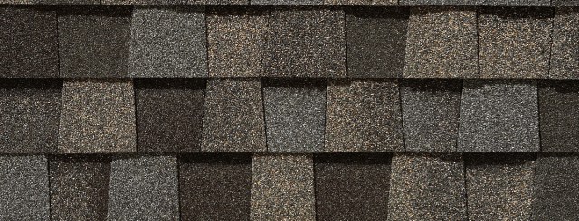
Max Def Weatherwood
Gutters: There are two schools of thought. I usually like to blend the gutters away and try to match them with the trim color OR make them a particular color that would play more as an accent. See the difference:


In this situation, I don’t really want to “see” the gutters so I’m going with a color that matches the trim.
Garage Doors- My new favorite garage doors are the wood grain version of the Amarr Classica or Oak Summit. I’ve used both the Walnut and the Golden Oak. I think the Walnut will look great on this home.


Last but not least: The Front Door- In my opinion, the front door is hugely important to a home. It is your guest’s first impression and can impact the overall look and feel of the home. My favorite style doors right now are double arched wood doors of any style. When a plan doesn’t have the space for double doors I often select an oversize door of either 3’6″ x 8′ or I have had custom 4’x8′ doors made on several occasions including my own home. The front doors don’t have to be expensive if you are on a tight budget, sometimes just having the right color can create a nice curb appeal. Here are some of my favorite doors I’ve used in the past:
This is the set of doors I’ve selected for this home:

Now that all the exterior selections have been chosen, I create a Selection sheet and turn in for ARB approval. I can’t wait to see it all come together.
lot-319p_exterior-specs-for-arb_detailed
Coming soon: CABINETS

We are enjoying your Countdown series! The “yellow house” has always been a fav since we walked through (more than once) during the Parade of Homes that year. And learning more about the “almost house” – that we almost purchased from 2016 and watching the 2017 house being built on the lot we “chose” while on a walk. Keep up the great work!