
Interior painting has been going on this past week. Which allows me to finally get to talk about my favorite part of the building process and the area I personally have the most control over- color and design. When I refer to having “the most control over” I don’t really have total control. Certainly, I get to chose what I feel will look great but I also have to keep in mind what would appeal to the masses. There have definitely been times when I have absolutely loved something but felt the selection would be too risky and ended up changing the selection to what would appeal to more people. Not to say I’ve got that concept down perfectly, as Neil will attest I end up pushing the envelope sometimes, but for the most part I try to be sensitive to trends as well as what the local market is wanting.
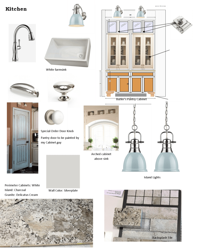
If you have been following along during the building process, I discussed the design of the kitchen in an earlier post. Within that post, I mentioned when designing a new home I like starting in the Kitchen because I feel it is the heart of the home and then work my way out from there. To refresh our memories, here is how the Kitchen will look. (Or you can read here to review the entire article.)
Let’s start this week looking at the two rooms adjacent to the Kitchen. The Powder Room and the Laundry Room. These two rooms may seem secondary at first thought, but in reality, the Powder Room will be the most visible bathroom guests will use, so it’s an important space. In this homeplan, I actually have a good size space to work with. In this situation, I chose the cabinet style first. I wanted a “furniture style” vanity but left the color undecided at this point.
Next, I chose the flooring. A lot of times in Powder Rooms I simply carry the hardwood flooring into the space. However, in this situation, when I went to the tile showroom I fell in love with a wood plank type tile that I wanted to use somewhere. Since this Powder Room is pretty good in size at 8′ long, I decided to use this tile in the Powder. I knew I wanted to add beadboard wainscoting on the walls. While looking at tile I had found some beautiful penny round tile that I loved and looked beautiful with the woodplank tile. So I decided to add the pennyrounds into the trim design. Once these two colors came together it was easy for me to decide on a Charcoal stain color for the vanity. Here’s what it looks like together.

The light fixture, plumbing fixture and upgraded toilet helps pull this room together creating a space any guest would love.

Final decision was paint color: Silverplate by Sherwin Williams 7649

Positioned right across from the Powder Room is the Laundry Room. Personally, I always try to put a lot of thought and color into the Laundry Room. I’m a mother of three active boys and spend a lot of time doing laundry. So I want this space to not only be functional but pleasant. For this home, the first selection was the tile. During a previous visit to Triangle Tile & Stone with a client I had seen a new display of tile that I loved. I knew I wanted to incorporate it somewhere, and decided the Laundry room would be the perfect place. The pictures of this tile doesn’t do it justice, it looks so much prettier in person. But here is a photo of the tile in the store.


I chose a pretty shade of blue-gray for the cabinet color (shown in the picture above) which coordinates beautifully with the floor. I wanted this space to be very functional by adding cabinets and a hanging bar above the washer/dryer side along with a white quartz countertop and laundry sink. The area beside the laundry sink will be one open shelf to fit two laundry baskets.

On the other wall, I wanted to incorporate a “Dropzone” area for bookbags, shoes, coats, etc. plus a Mail Center and Broom closet. Here’s the layout. I did tweak the drawing by making the Mail Center the same size as the Broom Closet.

Added two pendant light fixtures

Wall color:
Seeing how it’s all coming together almost makes me want to do a load of laundry, well maybe not, but I am super excited about this space and can’t wait to see it finished. Join me next week when we look at one of my favorite areas. . . the Master Suite.

Can’t wait to see it!! I think I know which client you were with when you saw that laundry room tile, and you’re right, it’s GREAT! Another great article Joy, but it did not inspire me to do a load of laundry!! 🙂
What’s so cool about that tile, is your bathroom is so glamorous and looks beautiful and I’m going for a completely different look and it looks great.
I love it!! Can’t wait to see it once it is completely finished!
You are right, the fun part is now! We walked through and love those lights over the island and butler’s pantry. The kitchen is so big, full of light, and just beautiful. Looking forward to the Parade of Homes!