
#2: How could “artichoke” turn out so good
If you read my last blog post and couldn’t wait to read about what my #2 favorite design feature for 2018, I hope you are not disappointed when you find out it has to do with the color Artichoke of all things. Not only that, the space we are going to look at today is a Guest Bath. I know, I know, usually a Guest Bath is not very glamorous and exciting as other spaces but the way this particular space came together ended up being my most surprising favorite design feature for 2018.
So what does “artichoke” have to do with anything?. . . Let’s start from the beginning. If you’ve read any of my blogs before you know that I have been using this great custom cabinet maker, Bryant. He’s my guy. What I love about Bryant is I can give him a photo or sketch and he can make it happen. I’ve definitely been spoiled by Bryant because he lets me choose any paint color from a Campbell paint fan (similar to the size of a Sherwin Williams paint fan).

To some, that may seem overwhelming, but to me, it’s like my 10 year old that just walked into a candy store and gets to pick from anything he wants. 
Our first cabinet selection meeting my client chose a pretty blue-gray color. We found a good neutral quartz remnant and it coordinated perfectly with this beautiful patterned tile floor and classic white subway for the shower walls. It all looked great together, the client was happy, I loved it and placed the order.

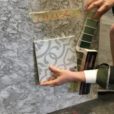
Then, about a week later, my client texted me a Pinterest photo she had seen of an “artichoke” color vanity that she absolutely loved and wanted to change the guest bath to incorporate this new color. I immediately pulled out my paint fan and sure enough there was a color called artichoke that looked like a perfect match. I’m going to be honest, when I saw the word “artichoke” I’m pretty sure my nose crinkled a little. But I put the new color up against the patterned tile sample I had in my office and to my surprise it actually looked pretty good. Thankfully, Bryant hadn’t painted the cabinets yet, so we made the change. We then went back to the Granite supplier with our two samples and low and behold like a shining star beckoning us—the perfect remnant revealed itself like it was waiting for us all along.
So even though Artichoke would have never made it into Joy’s 1000 Favorite Colors List (well, if I actually had one) I have to admit, when it all came together I ABSOLUTELY LOVED IT! That’s what makes my job so great. It’s not about me and what I like, this is not my house. It’s about helping my clients navigate through all the options and feel confident about the decisions they make based on their wants, needs, and style. And in the end helping create the beautiful and functional space they will love to call home.


In the end, there were many beautiful and functional spaces in this home. I will actually be featuring another space from this home later this month. To see more photos from this home, click here. See if you can guess which other Design Feature made the list.

Love the color Joy!!!
Love the artichoke color!!!